A spectacular site in every way.
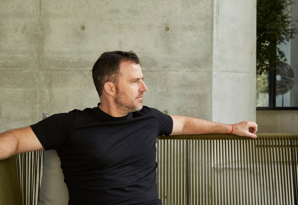
The beauty and awe-inspiring nature of the New Zealand landscape gives architects Lance and Nicola Herbst plenty to think about. The Auckland-based architects and co-founders of Herbst Architects have just completed Omata Beach House, a four-bedroom family beach house in a remote strip of coast four-and-a-half hours northeast of Auckland.
“Omata is a very unusual one. It’s a spectacular site in every way,” Lance says. “The task there was that when you’re putting something in such a pristine landscape, you really have a responsibility to be as sensitive to the landscape as possible.”
Omata follows in the footsteps of earlier Herbst Architects projects, which lean into maintaining, protecting and engaging the surrounding landscape with minimal impact on the local flora and fauna. Having grown up in the same city in South Africa and having attended the same university, Lance and Nicola moved to New Zealand and started their practice some 20-plus years ago with small beach houses on Great Barrier Island, 100 kilometres north-east of central Auckland – their own included – and the momentum began to build.
All of the home's windows are Vitrocsa.

“That was just a very interesting induction for us to get into thinking about designing in a New Zealand context,” Nicola says. “On that island, there are no services whatsoever. Everything is done on site. So you’re really fully immersed in the climate … The interesting thing about the second home is that it gives you an opportunity to really connect and, conceptually, everything spins around nature and the way you engage with it.

“We bring our thinking from those early days through to how we approach just about every decision we make, even to a larger, more well-appointed home or beach house. We see the second home as an opportunity to experience a whole other range of things, particularly seeing into nature and the beauty of it, and the sensory engagement – be it the wind, the sound of the waves, the feel on your skin, the crickets, the cicadas.”
They now specialise in these coastal abodes.
“We got a reputation for doing small beach houses, or ‘bachs’ as they’re called here. And over the past 20 years, things have kind of progressed,” Lance says. “We’re now doing bigger, more beach house-type properties. Our clientele has changed. [But] people are still wanting a response that is similar to what you’d do with a bach, which is one that is well engaged with the environment and sensitive and not ostentatious.
“The brief is always around joy and it’s always around the best part of life,” he adds. “The beach house is the place you go when you’re not working; you’re relaxing. The underlying brief for these buildings is something that’s joyous. It’s also a place where people are happy to experiment.
“A lot of things we do are around pushing an engagement with nature and feeling the breeze and going outside.”
This connection was realised in an extreme way with two projects that were required to directly integrate with protected, mature pohutukawa trees: Kawakawa House Piha and Under Pohutukawa, which won the NZIA New Zealand Architecture Award in 2018 and 2012 respectively. Lance says working with and respecting the existing landscape is key, with the footprint limited to what functions in the surrounding environment.
“We’re very fortunate that we get presented with the most incredible sites. They are incredibly rich in terms of expansive views but also generally come with really established flora and fauna, which is very particular to New Zealand. A lot of time is spent thinking about how we draw a building out of the landscape rather than put one into it,” says Lance. “Everything about it in terms of materials and textures and colours, it’s always referring back to that, always very sensitive of that.”
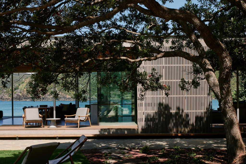
In the case of Omata, a minimalist visual impact on the sloping patch of private, secluded bay was paramount. The project involved furnishing an existing building on the hill and building a beach house on the dunes for a family with three young children, in-laws and extended family visiting from overseas. It features natural timber textures, shaped concrete and an integration of careful plantings amid established foliage.
“Every space has a reason, has a compact quality in the sense that there’s only one living room, if the weather is inclement, you’ll be in that living room and in that space,” says Nicola. “And then when the weather is playing ball, so to speak, the lanai [the covered outdoor space] becomes the focal point and the kitchen views out to it and so it’s serviced by the kitchen.”
A lot of time is spent thinking about how we draw a building out of the landscape rather than put one into it.
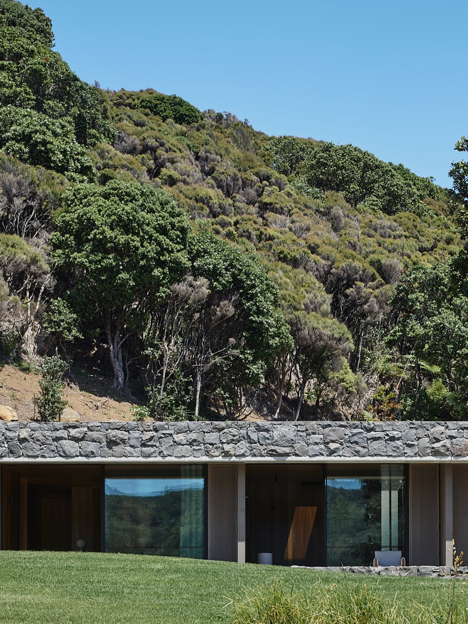
The completion of inundation and seismic reports revealed restrictions on relative building levels, and how the property would have to respond to storm surges, sea-level rise and the possibility that the massive boulders embedded in the hills behind could tumble down into the house.
“We were looking for ways to keep the building as low and unobtrusive as possible. The concept really broke the building into three parts,” Lance says, separating the spaces into two buildings that delineated bedrooms from communal living spaces, as well as providing an outdoor space anchored by a fire.
“We come from a masonry background; we don’t come from a timber background,” says Nicola. “We feel like we’re coming full circle, bringing back in some permanent materials that can take anything that’s thrown at them.”
Those materials include rocks that clad the outdoor walling of the bedroom spaces to create a seawall, and nod back to the hill’s stone composition.
“Rocks are rolling down the hill and poetically getting made into the wall of the bedrooms, [which are] essentially becoming part of the landscape rather than the building,” Lance says. “We contoured the ground. It feels like the building was built onto natural ground but the land was lifted a metre and a half to meet the required relative level.
“We wanted something where you could look right through to the beach. The building itself becomes a wind break,” he says. “We wanted it to feel like a floating roof in the landscape and as unobtrusive as possible when viewed from the beach.”
Every single space of the home has an opening to the outside world, including bathrooms that open into private courtyards. Omata also has direct beach access. The home is anchored by a series of Vitrocsa Sliding doors “that allow you to edit out the wind,” Lance says. It was a combination of the slimline profile of the Sliding doors, and the engineering of such massive panels, that allowed the pair to achieve the appearance of the floating roof.
To have such an elegant resolution for your glazed panels, that’s the ideal scenario.

“Even when the doors are closed, it maintains its sense of lightness,” Lance says. “You only really close up the glass for short amounts of the year when it’s bad weather. Even if you’re sitting with blankets by the fire, that’s how people live on the beach.”
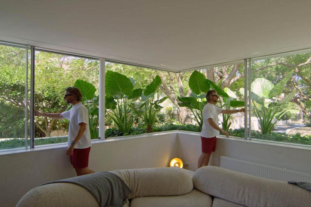
All of the home's windows are Vitrocsa as well, supported by a series of custom shutters that allow the moderation of wind in both directions.
“We needed them for the living [space] in order to execute the concept of that correctly, but we carried them through to the bedrooms as well because they’re really good sliding systems.”
Omata Beach House was the first Herbst project that utilised the Vitrocsa system, but, as Herbst Architects build more beach houses, “we have them on the drawing board for two more [projects] now,” Lance says.
“Usability and the low-profile are the main things,” he says. “You can do this now with much more confidence, minimising the interference between inside and out. We’re very pleased with the outcome for the first time we’ve used [Vitrocsa].”
Nicola adds that the “Vitrocsa system is by far the most beautiful that we’ve had the opportunity to work with.”
“In a building that is essentially kind of like a modern pavilion, and where glass is a big feature, to have such an elegant resolution for your glazed panels, that’s the ideal scenario. That’s why we went to Vitrocsa.”
Visit
Share
Credits
- Riley Wilson – Words
- Herbst Architects – Architecture
- Lance Herbst | Nicola Herbst | Sianne Smith – Project architecture
- Bell Construction – Contractor
- Sullivan Hall – Structural engineering
- Jared Lockhart – Landscaping
- Scott Zegers Design – Furniture and accessories
- Simon Wilson – Architecture photography
- Jackie Meiring – Portrait photography
- Vitrocsa Australia – New Zealand – Doors and windows
